


Your welcome sign is often the first thing people notice when they walk into your space. It sets the tone for their experience and gives them a quick sense of what your business is all about. Whether it’s a small shop, a café, or a front office, a good sign can make the space feel more personal, more polished, or just more “you.”
Why the Right Welcome Sign Matters
A welcome sign is often the first point of visual contact between a business and its visitors, making it a key element in shaping perceptions. More than just a decorative feature, it functions as a silent representative of your brand conveying professionalism, style, and purpose before any words are exchanged. A well-designed sign can set the tone for client meetings, reassure guests, and create a sense of trust and credibility. Whether it’s displayed in a corporate lobby, retail entrance, or reception area, the right welcome sign helps businesses stand out, improves navigation, and reinforces a cohesive brand identity from the very first impression.
Understand Your Brand Identity
Your welcome sign should reflect the essence of your brand not just through words, but through visual language. Everything from the choice of material to the color scheme and typeface plays a role in communicating who you are. A luxury brand might choose brushed metal with minimalistic lettering, while a wellness studio may lean toward mirrored acrylic or brushed steel to convey calm and simplicity.
Consistency is key. Your sign should align with other elements of your visual identity, such as your logo, website, office décor, and printed materials. When your signage feels like a natural part of your overall brand environment, it helps visitors instantly recognize your values and builds credibility from the first glance.
Material Durability and Maintenance
A welcome sign isn’t something most businesses want to replace often so choosing the right material from the start can save time and cost in the long run.
Beyond appearance, materials vary in how they respond to wear, cleaning, and environmental exposure. Understanding how each performs helps match the sign to the space it will be used in.
1. Acrylic (Gloss, Matte, Mirror)
Acrylic is a solid, low-maintenance material for indoor signs. It resists cracking and warping under normal conditions. Mirror ffinishes look sharp but show fingerprints and dust more easily. Glossy acrylic offers a sleek, polished look, ideal for modern interiors.
- Best for indoor walls, desks, and reception zones
- Clean with mild soap and a soft cloth avoid alcohol-based cleaners on mirror finishes
2. Layered and Dimensional Signs
Multi-layer or 3D signs collect more dust, especially around raised edges and cutouts. They’re sturdy but require occasional cleaning to keep sharp detail visible.
- Good for offices, studios, or shops where design is part of the branding
- Use a microfiber cloth or soft brush for corners and layers
3. Painted or Custom-Coated Acrylic
Painted signs or custom-colored panels are more sensitive to sunlight and humidity. If placed near windows or vents, they may fade or peel over time unless properly finished or positioned.
- Suitable for controlled indoor environments
- Keep away from heat sources and direct sunlight
4. Mounting Methods and Hardware
Mounting matters. Signs with standoffs or spacers allow for airflow and easier cleaning. Adhesive-mounted options can fail if used on textured or dusty surfaces.
- For long-term use, standoffs are more secure and easier to maintain
How to Choose a Welcome Sign for Your Business
Choosing the right style of welcome sign depends not only on your interior design but also on the nature of your business. Different industries call for different visual approaches; some signs need to look formal and restrained, while others should feel expressive and attention-grabbing. Below are practical options by business type.
1. Offices, Agencies, and Service Providers
Businesses with a formal or corporate tone usually benefit from clean, professional signage that doesn’t distract from the company’s core message
- Black or white acrylic name plates with engraved or raised lettering
- Brushed metal signs in aluminum, bronze, or gold finishes
- Rectangular or straight-edged shapes for a sharp, minimal appearance
These choices suit law firms, financial services, medical offices, and consulting companies.
2. Salons, Studios, and Boutique Brands
Brands in the beauty, retail, and design space often prefer signage that makes a stronger visual impression and reflects their aesthetic.
- Mirror acrylic signs in gold, silver, or rose gold
- Rounded or arched signs with layered materials
- Dimensional lettering with color contrast
This style works well in hair salons, clothing boutiques, creative agencies, and interior showrooms.
3. Creative and Hospitality Spaces
In spaces where individuality and atmosphere matter, signage can be more experimental and design-forward.
- Layered signage for added depth and visual interest
- Custom-cut forms or hand-drawn typefaces for a personal touch
- Ideal for cafés, studios, galleries, and lifestyle brands.
Ideal for cafés, studios, galleries, and lifestyle brands.
4. Portable & Flexible Signage Solutions
For businesses that need movable or free-standing signage such as retail shops, studios, and venues, portable formats offer a practical mix of visibility and design. These signs don’t require wall space and can be repositioned as needed, making them ideal for sidewalk placement, entryways, or temporary displays.
Featured options from the collection:

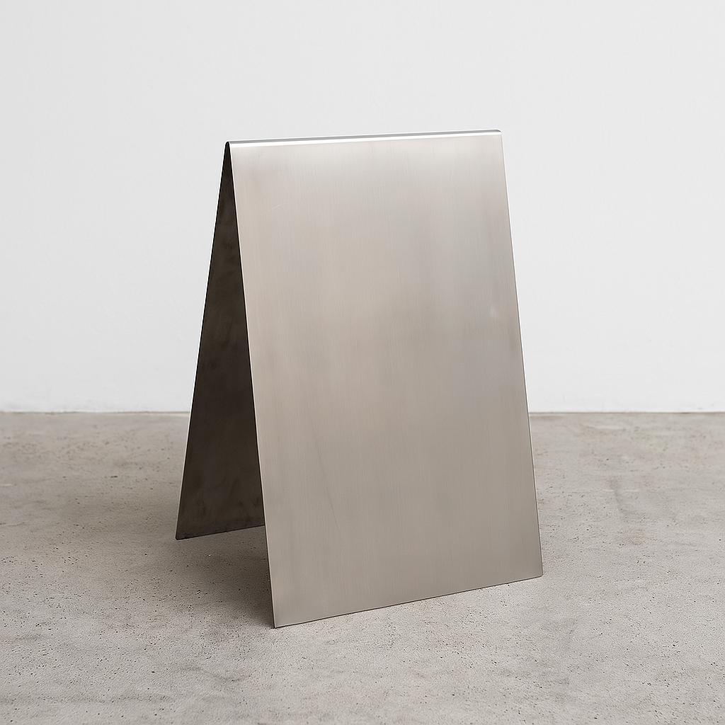
- Stainless Steel A-Frame Sidewalk Sign - durable, modern, and suitable for indoor or outdoor use

- Black Stainless Steel A-Frame Sidewalk Sign - minimal and bold, with a matte black finish

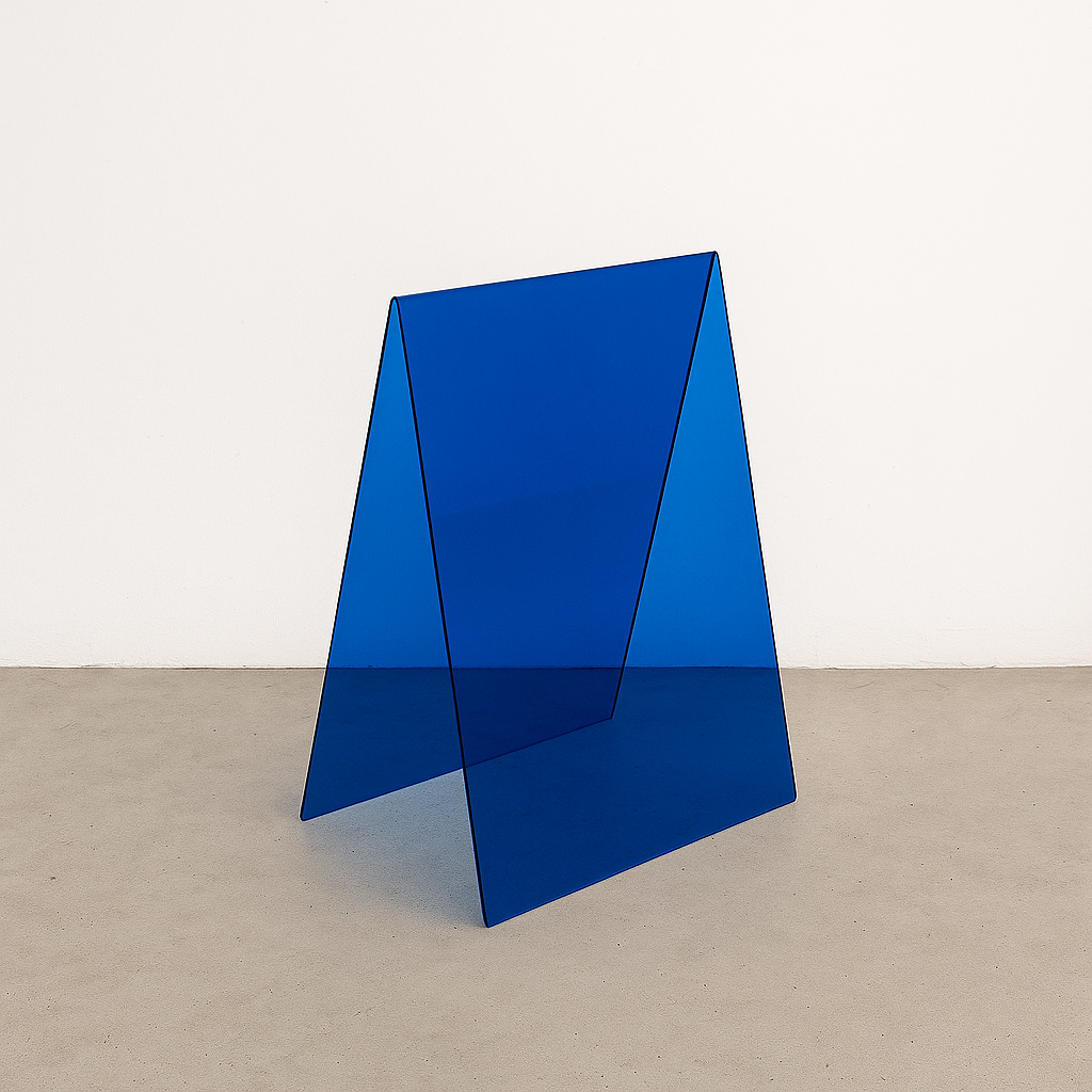
- Acrylic A-Frame Sidewalk Sign - lighter and more translucent for softer interiors

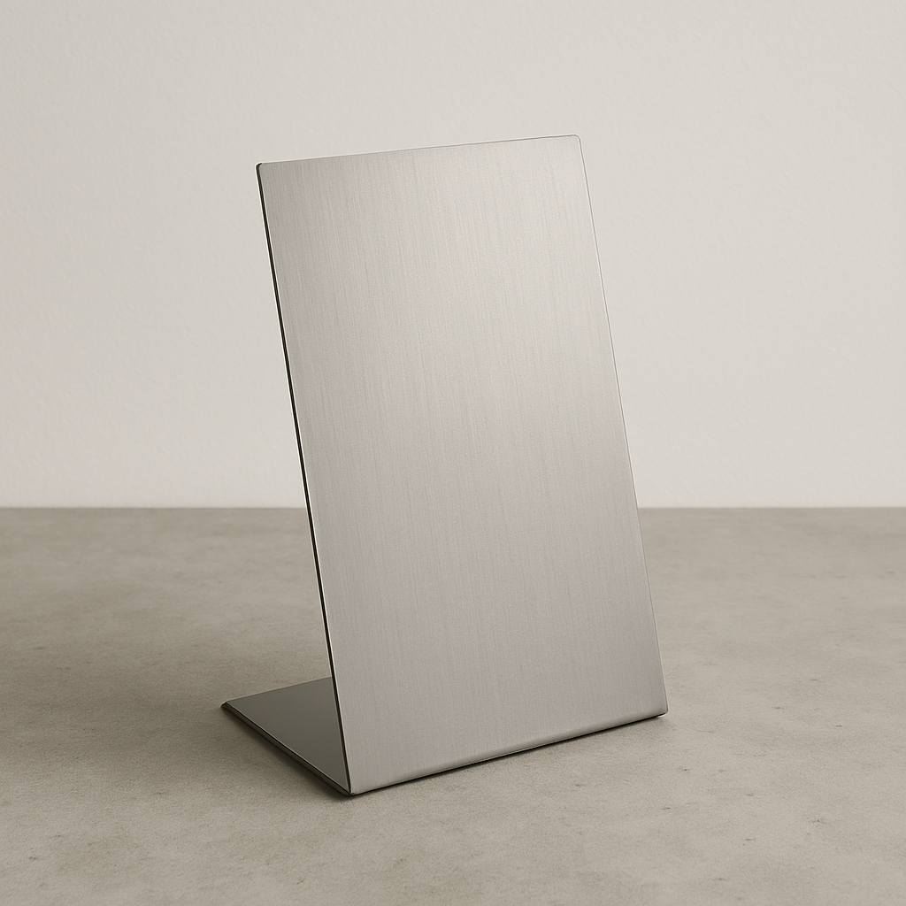
- Stainless Steel Standing Sign - compact and freestanding, ideal for wayfinding or branding accents
These styles are especially useful in changing environments, from rotating exhibitions to seasonal storefronts.
5. Custom Options for Unique Spaces
Not every business fits neatly into a predefined category, and some spaces require more specific solutions. Custom signage is useful when standard shapes, colors, or sizes don’t align with interior design, brand guidelines, or architectural limitations.
A custom welcome sign allows full control over layout, materials, and finishes. This is especially practical for businesses with non-standard branding, unique wall surfaces, or specific mounting needs. Whether the goal is to match a very particular color palette or combine multiple materials into one design, a made-to-order sign provides the flexibility to get it right.
Options That Fit Any Style
At Signs and Mirrors, we offer more than just custom solutions. Our collection includes ready-made signs in a range of shapes, materials, and finishes suitable for both minimal spaces and bold, design-forward interiors. Whether you're looking for mirror acrylics, soft-toned arch signs, or layered compositions with depth, there are options for different styles and industries.
We regularly share finished projects, new formats, and installation ideas on Instagram, where you can see how different businesses are using signage to shape their spaces.
Checklist Before Ordering a Welcome Sign
Before placing an order for a welcome sign, it’s worth pausing to review a few practical and design-related details that often get overlooked. A sign doesn’t just need to look good, it needs to suit the space, reflect your branding, and be compatible with the surfaces and materials it’s going onto. This checklist helps ensure you're not making assumptions that could lead to rework or installation issues later on.
Visual Consistency with Branding
The design of the sign should align with your brand’s visual identity. That includes fonts, colors, and materials that match what's already used in your logo, website, and printed materials. A sign that feels disconnected from your overall style can create confusion or dilute your presentation. Sticking with familiar visual elements creates a cleaner and more unified experience for anyone entering your space.
Compatibility with the Mounting Surface
Understanding the material of the surface the sign will be mounted on is essential before placing an order. Drywall, glass, brick, tile, and concrete all require different mounting approaches. Some surfaces might need special hardware like wall anchors or standoffs, while others are better suited for adhesive options. Choosing a sign without knowing how it will actually attach can lead to delays or structural issues.
Cleaning and Material Sensitivity
Consider how the sign will be maintained once it's installed. Some finishes like high-gloss acrylic or mirrored surfaces tend to show fingerprints, smudges, or dust more quickly. Others, like brushed metal or textured matte surfaces, are lower-maintenance and hide wear better. If the sign is being installed in a high-touch or visible area, choose materials that won’t require constant attention to stay looking clean.
Durability and Long-Term Use
Think about whether the sign is intended as a temporary piece or something permanent. Some materials, like lightweight plastics, are better for short-term use or changing displays. Others such as aluminum, layered acrylic, or composite panels are designed to hold up over time. Being clear on lifespan helps you avoid under- or over-investing in a product that doesn’t match your timeline.
Installation Tools and Support
Check what’s required to actually install the sign once it arrives. Some signs need measuring, leveling, drilling, or alignment with multiple parts. Others may arrive ready to hang with pre-drilled holes or adhesive strips. If the installation sounds like more than a one-person job or if you don’t have the necessary tools, factor in whether you’ll need outside help to get it done properly.
Choosing the Right Placement for Your Welcome Sign
Where you put your welcome sign matters just as much as what it looks like. A well-placed sign draws attention naturally, feels integrated into the space, and helps guide people the moment they step inside. Poor placement, on the other hand, can make even the most thoughtful design easy to overlook.
1. Eye-Level Mounting
In most indoor settings, signs look best when their visual center sits around 58 to 62 inches from the floor; this lines up with average eye level and feels most natural. If the sign is going behind a desk or reception counter, raise it a bit higher so that nothing blocks the lettering. In high-ceilinged rooms, you may need to adjust the height to maintain a balanced look.
2. Observe How People Move
Placement should match how people actually enter and use the space, not just where there’s a free wall. The sign should meet the viewer’s line of sight without them needing to turn or look around. Watch the flow of foot traffic and you'll get a better sense of where attention naturally goes.
- Place the sign where it’s easy to spot upon entry
- Avoid corners, cluttered walls, or awkward gaps between furniture
3. Avoid Visual Clutter
Signs compete for attention with everything else in the room. Avoid placing them too close to door frames, windows, art, or lighting fixtures. These elements can distract from the message or make the sign harder to notice.
4. Check the Lighting
A sign in a shadowed area might go unnoticed, while one in direct sunlight or glare from overhead fixtures can be hard to read. If the space has uneven lighting, consider adding backlighting to the sign or choosing materials with a non-reflective finish.
5. Fit the Context
The environment should guide the placement. In narrow hallways, a vertical sign may make more sense than a wide one. In a visually busy reception area, find a clean background so the sign has room to “breathe.” The goal is to make it feel like the sign belongs, not like it was squeezed in.
Conclusion
Choosing a welcome sign isn’t just a design decision, it's a practical one. The right sign should reflect your brand, fit the space it’s installed in, and hold up over time. By focusing on material durability, proper sizing, placement, and overall visual consistency, businesses can avoid common issues and create signage that adds real value from day one.
Whether you're using a standard format or a fully custom design, a good welcome sign helps communicate professionalism and creates a stronger first impression for every visitor.
FAQ
What material is best for indoor welcome signs?
Acrylic is the most common and versatile. Glossy acrylic offers a polished look, mirror acrylic adds visual impact, and layered acrylic signs create depth. All are lightweight and easy to maintain indoors.
How big should my welcome sign be?
The sign should take up around 50-70% of the width of the wall it’s going on. For readability, each inch of letter height is readable from roughly 10 feet away.
Should my welcome sign be backlit?
Backlighting helps with visibility in dim areas and adds a clean, professional look. It’s not essential, but it works well in corporate spaces or darker entry zones.
Can I mount a welcome sign on any wall surface?
Most signs can be mounted on drywall, tile, glass, or concrete, but the mounting method will vary. Use standoffs for hard surfaces and adhesive only on smooth, clean walls.
How often do welcome signs need maintenance?
Most acrylic signs need only occasional dusting or wiping with a soft cloth. Mirror finishes may need more frequent cleaning to remove fingerprints and streaks.
Is a custom sign worth it?
If your space, brand, or mounting conditions are unique, a custom sign offers more control over materials, shape, and finish. It's often the best option for non-standard interiors.